
JCB
Payment Network
Rated 5.0/5 from 2,094 votes
Brand Info
Report outdated or incorrect assets.
6+ JCB Logo PNG & SVG Vectors HD Quality


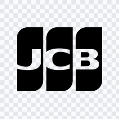


Table of Contents 11 sections
- Download JCB PNG Logo
- About Japan Credit Bureau
- Meaning and History of the JCB Logo
- Evolution of the Logo
- JCB Color Palette
- Frequently Asked Questions
- Can I use the JCB logo for commercial purposes?
- What file formats are available?
- What does the symbol represent?
- What font is used in the JCB logo?
- Why is the logo so consistent over time?
Welcome to Zona Logo. You can download the JCB logo in PNG and SVG formats. You can also download the PNG logo with a transparent background in high resolution (HD) for free.
Download JCB PNG Logo
Please select the file above according to your needs, then press the download button to obtain the desired file:
| File Name | Japan Credit Bureau (JCB) |
| File Type | PNG, SVG |
| File Size | 18 KB - 240 KB |
If you encounter issues while downloading the JCB logo or if the provided link is inaccessible, you can report it through the Contact Us page.
About Japan Credit Bureau
JCB is Japan’s homegrown international payment brand, widely recognized for connecting cardmembers, merchants, and financial institutions through a global acceptance network. Founded in 1961 in Japan and expanding internationally from 1981, the company has grown from a domestic card issuer into a globally accepted payment network with strong roots in service culture, reliability, and long-term partnerships. While many people first encounter it as a card brand on the front of a credit or debit card, its role in the ecosystem is broader: it supports authorization, settlement, fraud prevention, and brand programs that help issuers and merchants build trust with customers.
Across its communications, the brand consistently emphasizes security, reliability, and seamless payment experiences. Those principles show up in its approach to risk controls, its collaborations with banks and fintech partners, and its efforts to serve travelers and cross-border commerce. Sponsorship and cultural partnerships also reinforce its identity as a Japanese-origin brand with international reach—positioning it as both a familiar domestic leader and a credible global network.
Meaning and History of the JCB Logo
The official emblem is a modernist wordmark built around three bold initials. Its impact comes from clarity rather than complexity: the letters are designed to be instantly readable at small sizes (such as on a card corner, terminal screen, or receipt) while remaining distinctive at large scale in signage and digital advertising.
Visually, the mark is defined by three overlapping rectangular panels—a design gesture that does several jobs at once:
- Modularity and systems thinking: The panels suggest a network made of interoperable parts—issuers, merchants, and cardmembers—operating within a single framework.
- Layering and acceptance: Overlaps imply connection and interoperability across borders, currencies, and payment contexts.
- Confidence and legibility: The chunky letterforms and squared geometry are engineered for high recognition in environments where the brand symbol must compete with other networks.
Color plays a central storytelling role. Rather than relying on a pictorial icon, the brand uses a tri-color architecture to create distinction. This approach aligns with late-20th-century corporate identity logic: high-contrast color fields plus a simplified wordmark produce a strong signature across print, plastic card production, and digital UI surfaces.
For practical usage, many designers look for a clean JCB PNG file for mockups or presentations, and teams working on scalable interfaces often prefer a JCB SVG in vector format to keep edges crisp across resolutions. When used properly, the mark’s geometry holds up exceptionally well in both small and large applications.
Evolution of the Logo
The identity has been remarkably consistent, which is typical for payment networks where trust and recognition are strategic assets. Rather than frequent redesigns, the brand’s changes have generally followed a pattern of refinement—tuning proportions, improving reproduction quality, and adapting for new contexts such as high-density screens, digital wallets, and app-based payment flows.
Historically, the most meaningful shifts have been less about altering the core initials and more about systematizing usage: specifying clear space, minimum sizes, and correct color handling so the emblem performs reliably across merchant decals, POS materials, online checkout pages, and partner communications. This conservatism is deliberate. In financial services, a stable visual identity supports perceived continuity, which is closely linked to consumer confidence and partner adoption.
Design takeaway: The power of this identity is not novelty—it is disciplined consistency, engineered for instant recognition at the moment of payment.
JCB Color Palette
The brand is closely associated with a three-color palette—commonly rendered as blue, red, and green—applied in vertical blocks behind the initials. Exact values can vary slightly by production method and brand guidelines, but the following hex codes are widely used as practical approximations for digital design:
- Blue: #0B4EA2
- Red: #E31E24
- Green: #1A9A4A
In identity terms, the palette balances dependability (blue), energy and decisiveness (red), and growth or harmony (green). The resulting triad is highly distinctive in the payments category, where many competitors lean heavily into one dominant color. For best results, designers should avoid reinterpreting the hues too freely; small shifts can weaken recognition when the mark appears beside other network badges.
Frequently Asked Questions
Can I use the JCB logo for commercial purposes?
For commercial use—especially in marketing, product packaging, or merchant-facing materials—request permission or follow official brand guidelines from the company or an authorized partner. This helps ensure correct presentation and avoids trademark issues.
What file formats are available?
On this page, the available formats are PNG and SVG, suitable for both quick previews and scalable design workflows.
What does the symbol represent?
The mark is a typographic emblem built from the brand’s initials. The overlapping color panels suggest connection and interoperability—an abstract representation of a payment network linking multiple participants across locations and use cases.
What font is used in the JCB logo?
It is not a standard off-the-shelf font. The lettering is a customized, geometric logotype engineered for legibility and reproduction on cards, screens, and print. For brand-consistent work, it’s best to use the official artwork rather than trying to typeset it.
Why is the logo so consistent over time?
In payments, recognition equals trust. A stable emblem reduces confusion at checkout and reinforces reliability for cardmembers and merchants, while refinements typically focus on technical reproduction and digital readiness rather than visual reinvention.
AI-Generated Content
This description was generated by AI and may contain inaccuracies.


