
Indomaret
Convenience Store
Rated 5.0/5 from 984 votes
Brand Info
Report outdated or incorrect assets.
4+ Indomaret Logo PNG & SVG Vectors HD Quality

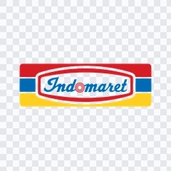

Table of Contents 11 sections
- Download Indomaret PNG Logo
- About Indomaret
- Meaning and History of the Indomaret Logo
- Evolution of the Logo
- Indomaret Color Palette
- Frequently Asked Questions
- 1. Can I use the Indomaret logo for commercial purposes?
- 2. What file formats are available?
- 3. What do the colors in the Indomaret brand symbol represent?
- 4. Has Indomaret changed its logo كثيرًا over time?
- 5. Why is the Indomaret visual identity so recognizable?
Welcome to Zona Logo. You can download the Indomaret logo in PNG and SVG formats. You can also download the PNG logo with a transparent background in high resolution (HD) for free.
As one of Indonesia’s most recognizable convenience store chains, Indomaret has built a visual identity that is instantly familiar across cities, towns, and residential neighborhoods. For visitors searching for the Indomaret logo, official emblem references, or files suitable for web and print use, this profile explains the brand’s background, the meaning behind its visual identity, and the design features that make it so enduring.
Download Indomaret PNG Logo
Please select the file above according to your needs, then press the download button to obtain the desired file:
| File Name | Indomaret |
| File Type | PNG, SVG |
| File Size | 18 KB - 220 KB |
If you encounter issues while downloading the Indomaret logo or if the provided link is inaccessible, you can report it through the Contact Us page.
About Indomaret
Indomaret is a leading Indonesian convenience store brand operating under PT Indomarco Prismatama. Established in 1988, it began as a retail concept aimed at providing practical daily shopping for local communities, then expanded rapidly into one of the country’s largest minimarket networks. Its footprint now spans thousands of outlets, making it a familiar part of everyday urban and suburban life in Indonesia.
The brand’s business model combines neighborhood accessibility, standardized store operations, and a broad merchandise mix. Customers rely on its locations for groceries, snacks, beverages, toiletries, household goods, payment services, and digital transactions. Beyond in-store retail, it has also developed franchise and waralaba opportunities, helping entrepreneurs participate in its growth while preserving a consistent customer experience.
Another important dimension of its identity is service innovation. Through Klik Indomaret and related digital touchpoints, the company has expanded from a traditional minimarket into an omnichannel retail brand. Shoppers can browse promotions, order products online, access delivery services, and use iPayment and other practical features that align with changing consumer expectations. This combination of physical convenience and digital utility has helped the company remain highly relevant in Indonesia’s competitive retail sector.
Indomaret also presents itself as a community-oriented enterprise. Its support for UMKM initiatives, promotional partnerships, and localized offerings reinforces the idea that the company is not simply a chain retailer but a participant in everyday neighborhood commerce. That positioning plays a major role in how its visual identity is perceived: approachable, dependable, and immediately recognizable.
Meaning and History of the Indomaret Logo
The Indomaret logo is one of the clearest examples of practical retail branding in Southeast Asia. It uses a compact rectangular sign structure with horizontal color bands and a central wordmark that communicates speed, familiarity, and visibility from a distance. The design is optimized for storefront signage, packaging, promotional materials, and digital interfaces, which explains why it has remained so memorable over time.
Its most recognizable feature is the layered frame built from red, yellow, and blue bands. These colors create a vibrant visual rhythm that feels energetic without becoming overly complex. The central wordmark is typically set in a rounded, italicized script-like style, giving the brand symbol a friendly and informal tone. That softness balances the geometry of the surrounding frame, making the overall composition both structured and welcoming.
From a symbolic perspective, the stripes can be read as a cue for variety, movement, and accessibility. The rectangular container suggests order and consistency, qualities that matter greatly in convenience retail. Meanwhile, the flowing text helps humanize the mark, preventing it from feeling cold or corporate. In practice, the design works because it communicates exactly what customers expect from the chain: a fast, reliable, neighborhood-focused shopping experience.
For users seeking the Indomaret PNG or an Indomaret SVG for editorial, informational, or reference purposes, the appeal of the mark lies in this blend of simplicity and instant recognition. It reproduces well in vector format, and the strong color blocking also works effectively on signage, digital banners, and transparent background assets.
Evolution of the Logo
The brand has maintained a remarkably stable visual identity across its history. Unlike companies that repeatedly reinvent their appearance, Indomaret has favored continuity. This is a strategic advantage in convenience retail, where consumers often make split-second decisions based on familiar signage and trusted visual cues.
Earlier versions of the mark established the same basic architecture seen today: a bordered shape, multicolor striping, and a flowing wordmark. Over time, refinements have focused more on technical polish than on radical redesign. Proportions have been cleaned up, edges have become sharper, and digital reproduction has improved for online platforms and mobile screens. However, the essence of the identity has remained intact.
This restrained evolution reflects strong brand discipline. By preserving the core emblem, the company has reinforced recognition across generations of shoppers. In a market crowded with promotional graphics and competing storefronts, that consistency is a major asset.
A successful retail identity does not always need dramatic change; sometimes its strength comes from repetition, familiarity, and trust built over decades.
Indomaret Color Palette
The company’s color palette is central to its visibility. While exact usage may vary slightly by application, the identity is widely associated with three core colors: red, yellow, and blue, usually paired with white for contrast. These tones help the sign stand out in busy streetscapes and make the visual identity easy to recognize from afar.
- Red – often associated with energy, urgency, and promotional appeal. Approximate hex: #E1251B
- Yellow – conveys warmth, accessibility, and optimism. Approximate hex: #F4C300
- Blue – suggests trust, stability, and reliability. Approximate hex: #1E5AA8
- White – used for clarity and clean contrast. Approximate hex: #FFFFFF
Together, these colors create a bright, high-visibility system that suits storefront branding and high-frequency retail communication. The palette is not luxurious or understated; it is intentionally direct, readable, and practical. That makes it an excellent fit for a minimarket brand that depends on quick recognition and broad public appeal.
Frequently Asked Questions
1. Can I use the Indomaret logo for commercial purposes?
You should seek official permission from Indomaret or the relevant rights holder before using the brand’s visual identity for commercial purposes. Trademarked assets should not be used in advertising, merchandise, or business materials without authorization.
2. What file formats are available?
The available file formats are PNG and SVG. PNG is useful for quick digital use, while SVG is ideal when you need a scalable vector format for crisp reproduction.
3. What do the colors in the Indomaret brand symbol represent?
The red, yellow, and blue palette is generally interpreted as expressing energy, friendliness, and reliability. Combined, these tones support the company’s image as an accessible and dependable neighborhood retailer.
4. Has Indomaret changed its logo كثيرًا over time?
No. The company has kept its core visual identity highly consistent. Most updates have been minor refinements for clarity, signage quality, and digital adaptation rather than complete rebranding.
5. Why is the Indomaret visual identity so recognizable?
Its recognition comes from long-term consistency, high-contrast colors, a memorable storefront sign structure, and nationwide exposure. The combination of a simple frame and friendly wordmark makes the emblem easy to remember in both physical and digital environments.
AI-Generated Content
This description was generated by AI and may contain inaccuracies.


